
HTML CSS and Javascript Basic Roadmap
1. HTML Basics
2. CSS Basics
3. Layout and Positioning
4. Responsive Design
5. CSS Frameworks
6. Javascript Basics
7. Project-based Learning
8. Javascript Advanced
9. Projects
HTML Learning
HTML stands for Hyper Text Markup Language for creating Web pages that describes the structure of a Web page. HTML elements tell the browser how to display the content.
HTML Document Structure
<!DOCTYPE html>
<html lang="en">
  <head>
    <meta charset="UTF-8" />
    <meta name="viewport" content="width=device-width, initial-scale=1.0" />
    <title>Document</title>
  </head>
  <body></body>
</html>
All HTML documents must start with a document type declaration:
The <!DOCTYPE html> declaration defines the HTML version, indicating that this document is an HTML5 document.
The <html> element is the root element of an HTML page that wraps the entire HTML content.
The <head> element contains meta information about the HTML page (e.g., title, links to stylesheets).
The <title> element specifies a title for the HTML page (which is shown in the browser's title bar or in the page's tab).
The <body> element contains the actual content of the webpage. I.e. It is a container for
all the visible contents, such as headings, paragraphs, images, hyperlinks, tables, lists, etc.
Imports (script, style...)
a. Script :
The <script> element is used to embed or reference JavaScript code in an HTML document.
Example: <script src="script.js"></script>.
b. Style :
The <style> element is used to define styles directly in an HTML document or link to an external CSS file.
Example: <link rel="stylesheet" href="styles.css">.
Html Comments
<!-- html comments-->
Html Tags
HTML uses tags to define and structure content.A browser does not display the HTML tags, but uses them to determine how to display the document.
An HTML element is defined by a start tag, some content, and an end tag:
<tagname> Content goes here... </tagname>
Html is not case sensitive.<head>=<HEAD>
1. Text Markup:
Here are some common text-related tags:
<h1>to<h6>: Headings (from largest to smallest).<p>: Paragraph.<strong>or<b>: Important or Bold text.<em>or<i>: Emphasized or Italic text.<u>: Underlined text.<br>: Line break.<hr>: Horizontal line to separate text using horizontal ruler.<mark>: Marked or highlighted text<small>: Smaller text<big>: bigger text<del>: Deleted text, strike a line through deleted text<ins>: Inserted text,underline inserted text<sub>: Subscript text, like H2O<sup>: Superscript text<abbr>: Defines an abbreviation or acronym like "HTML", "CSS".<address>: Defines contact information for the author/owner of a document like email address,physical address,phone number,etc.<bdo>: stands for Bi-Directional Override, used to override the current text direction<bdo dir="rtl"><blockquote>: Defines a section that is quoted from another source<cite>: Defines the title of a work<q>: Defines a short inline quotation<pre>: to display text as it is without ignoring spaces and next lines
HTML Headings
Heading tags in HTML are used to define headings of a document or a section and to display text importance.
They range from <h1> to <h6>, with <h1> being the highest (or most important) level and <h6> being the lowest.
Heading Tags
<h1>: The main heading or title of a document.<h2>: A secondary heading, typically used for sections within the main content.<h3>: A sub-section heading under an<h2>heading.<h4>: A heading for sub-sections under an<h3>heading.<h5>: A heading for sub-sections under an<h4>heading.<h6>: The least important heading, used for sub-sections under an<h5>heading.
Example
<!DOCTYPE html>
<html lang="en">
  <head>
    <meta charset="UTF-8" />
    <meta name="viewport" content="width=device-width, initial-scale=1.0" />
    <title>Heading Tags Example</title>
  </head>
  <body>
    <h1>Main Heading</h1>
    <h2>Sub Heading Level 1</h2>
    <h3>Sub Heading Level 2</h3>
    <h4>Sub Heading Level 3</h4>
    <h5>Sub Heading Level 4</h5>
    <h6>Sub Heading Level 5</h6>
  </body>
</html>
2. Links , Navigation and Images:
-
<a href="url">Link Text</a>: Creates a hyperlink. -
<img src="image_url" alt="Description">: Embeds an image.Anchor tag :
HTML links are defined with the
<a>tag Used to add links to your page.The link's destination is specified in the href attribute.<a href="https://google.com> Google</a> <a href="/nextto.html">next </a> -
first one is is called absolute link.
-
second one is called relative link.
Navigation:
Navigation can be achieved using various elements like
<nav>, <ul>, <ol>, and <li> for lists, creating menus and navigation bars.
Image tag :
HTML images are defined with the <img> tag. used to add to image to your pages.
The source file (src), alternative text (alt), width, and height are provided as attributes.
- src : Specifies the path(URL) to the image
- alt : Specifies an alternate text for the image
The alt attribute provides alternative information for an image if a user cannot view it. This can be due to connectivity issues, browser limitations, HTTP errors,
<img src="google.jpg" alt="google.com" width="104" height="142" />
<img src="/image.jpg" alt="my-image" width="104" height="142" />
3.Lists:
<ul>: Unordered list.<ol>: Ordered list.<li>: List item.<dl>: Defines a description list.<dt>: Defines a term in a description list.<dd>: Describes the term in a description list.
Unordered List (<ul>):
Represents an unordered list where each item is marked with bullets by default.
An unordered list starts with the <ul> tag. Each list item starts with the <li> tag.
<ul>
  <li>Item 1</li>
  <li>Item 2</li>
</ul>
Ordered List (<ol>):
Represents an ordered list where each item is marked with numbers by default.
An ordered list starts with the <ol> tag. Each list item starts with the <li> tag.
<ol>
  <li>First</li>
  <li>Second</li>
</ol>
HTML Description Lists
HTML also supports description lists. A description list is a list of terms, with a description of each term.
The <dl> tag defines the description list, the <dt> tag defines the term (name),
and the <dd> tag describes each term:
<dl>
  <dt>Coffee</dt>
  <dd>- black hot drink</dd>
  <dt>Milk</dt>
  <dd>- white cold drink</dd>
</dl>
Nested Lists
Lists can be nested inside each other to create sub-lists.
    <title>Nested List Example</title>
  </head>
  <body>
    <h1>Nested List</h1>
    <ul>
      <li>First item
        <ul>
          <li>First sub-item</li>
          <li>Second sub-item</li>
        </ul>
      </li>
      <li>Second item</li>
      <li>Third item</li>
    </ul>
  </body>
</html>
4.Tables:
used to arrange data into rows and columns.
<table>: Creates a table.<tr>: Table row.<td>: Table data (cell).<th>: Table header.<caption>: Defines a table caption<colgroup>: Specifies a group of one or more columns in a table for formatting,styling columns of a table<col>: Specifies column properties for each column within a<colgroup>element<thead>: Groups the header content in a table<tbody>: Groups the body content in a table<tfoot>: Groups the footer content in a table<th colspan="2">: To make a cell span over multiple columns<th rowspan="2">: To make a cell span over multiple rows
<table>
  <tr>
    <th>Header 1</th>
    <th>Header 2</th>
  </tr>
  <tr>
    <td>Data 1</td>
    <td>Data 2</td>
  </tr>
</table>

<!-- another eg: -->

<table>
  <tr>
    <th colspan="2">Person 1</th>
    <th>Person 2</th>
    <th>Person 3</th>
  </tr>
  <tr>
    <td>Astria</td>
    <td>Apsara</td>
    <td>Aurora</td>
  </tr>
  <tr>
    <td>20</td>
    <td>21</td>
    <td>22</td>
  </tr>
</table>

<!-- another Example -->

<html>
  <head>
    <style>
      table,
      th,
      td {
        border: 1px solid black;
        border-collapse: collapse;
      }
    </style>
  </head>
  <body>
    <h2>Empty Colgroups</h2>
    <p>
      Add "empty" col elements that represents the columns before the columns
      you want to style:
    </p>

    <table style="width: 100%;">
      <colgroup>
        <col span="3" />
        <col span="2" style="background-color: pink" />
      </colgroup>
      <tr>
        <th>MON</th>
        <th>TUE</th>
        <th>WED</th>
        <th>THU</th>
        <th>FRI</th>
        <th>SAT</th>
        <th>SUN</th>
      </tr>
      <tr>
        <td>1</td>
        <td>2</td>
        <td>3</td>
        <td>4</td>
        <td>5</td>
        <td>6</td>
        <td>7</td>
      </tr>
      <tr>
        <td>8</td>
        <td>9</td>
        <td>10</td>
        <td>11</td>
        <td>12</td>
        <td>13</td>
        <td>14</td>
      </tr>
      <tr>
        <td>15</td>
        <td>16</td>
        <td>17</td>
        <td>18</td>
        <td>19</td>
        <td>20</td>
        <td>21</td>
      </tr>
      <tr>
        <td>22</td>
        <td>23</td>
        <td>24</td>
        <td>25</td>
        <td>26</td>
        <td>27</td>
        <td>28</td>
      </tr>
    </table>
  </body>
</html>
5.forms
An HTML form is used to collect user input. The user input is most often sent to a server for processing.
<form> Element
The<form> element is a container for different types of input elements, such as: text fields, checkboxes,
radio buttons, submit buttons, etc. and it defines how the form data will be sent.
Attributes :
-
action: Specifies the URL where the form data should be sent.<form action="/submit-form"></form> -
method: Specifies the HTTP method to be used when submitting the form (GETorPOST).<form action="/submit-form" method="post"></form> -
enctype: Specifies how the form data should be encoded when submitting it to the server (e.g.,application/x-www-form-urlencoded,multipart/form-datafor file uploads).<form action="/submit-form" method="post" enctype="multipart/form-data" ></form>
<input> Element
The <input> tag in HTML is used to create interactive controls
within a html form that allows users to enter data.
Basic Attributes of the <input> Tag
- type: Specifies the type of input control to display.
- name: Specifies the name of the form control and is used as the key when the form data is submitted to the server.
- value: Specifies the initial value of the input control.
- placeholder: Provides a short hint that describes the expected value of the input field.
- required: Indicates that the input field must be filled out before submitting the form.
- disabled: Disables the input control, preventing user interaction.
- readonly: Makes the input field read-only.
- maxlength: Specifies the maximum number of characters allowed in the input field.
Input Elements
Various input elements can be used within a form to collect user data.
<input> element can be displayed in many ways depending on the type attribute
a. Text Input (<input type="text">)
Used for single-line text input.
<input type="text" name="username" placeholder="Enter your username" required />
b. Password Input (<input type="password">)
Used for entering passwords.
<input
  type="password"
  name="password"
  placeholder="Enter your password"
  required
/>
c. Email Input (<input type="email">)
Used for email addresses.
<input type="email" name="email" placeholder="Enter your email" required />
d. Number Input (<input type="number">)
Used for numeric input.
<input type="number" name="age" min="1" max="100" required />
e. Date Input (<input type="date">)
Used for selecting dates.
<input type="date" name="birthdate" required />
f. Radio Buttons (<input type="radio">)
Used for selecting one option from multiple choices.
<label><input type="radio" name="gender" value="male" /> Male</label>
<label><input type="radio" name="gender" value="female" /> Female</label>
g. Checkboxes (<input type="checkbox">)
Used for selecting multiple options.
<label
  ><input type="checkbox" name="subscribe" value="newsletter" /> Subscribe to
  newsletter</label
>
h. File Input (<input type="file">)
Used for file uploads.
<input type="file" name="profilePicture" />
i. Hidden Input (<input type="hidden">)
Used for storing hidden data that should be submitted with the form.
<input type="hidden" name="userid" value="12345" />
j. Color Input (<input type="color">)
Used for selecting colors.
<input type="color" name="favcolor" />
k. Range Input (<input type="range">)
Used for selecting a value from a range.
<input type="range" name="points" min="0" max="10" />
l. Submit Button (<input type="submit">)
Used to submit the form.
<input type="submit" value="Submit" />
m. Reset Button (<input type="reset">)
Used to reset the form fields to their initial values.
<input type="reset" value="Reset" />
n. Button (<input type="button">)
Used to define a clickable button (can be used with JavaScript).
<input type="button" value="Click me" onclick="alert('Button clicked!')" />
Other Form Elements
Textarea (<textarea>)
Used for multi-line text input.
<textarea
  name="comments"
  rows="4"
  cols="50"
  placeholder="Enter your comments"
></textarea>
Select (<select>) and Option (<option>)
Used for drop-down lists.
<select name="cars">
  <option value="volvo">Volvo</option>
  <option value="saab">Saab</option>
  <option value="mercedes">Mercedes</option>
  <option value="audi">Audi</option>
</select>
Labels (<label>)
Used to define labels for input elements.
The <label> element can be associated with an <input> element in two ways:
1.Using the for attribute:
The for attribute in the <label> tag should match the id of the corresponding <input> element.
<label for="username">Username:</label>
<input
  type="text"
  id="username"
  name="username"
  placeholder="Enter your username"
/>
2.Wrapping the <input> element:
The <input> element can be nested inside the <label> element.
<label
  >Username:
  <input type="text" name="username" placeholder="Enter your username"
/></label>
Fieldset (<fieldset>) and Legend (<legend>)
Used to group related elements in a form and provide a caption for the group.
<fieldset>
  <legend>Personal Information</legend>
  <label for="fname">First Name:</label>
  <input
    type="text"
    id="fname"
    name="fname"
    placeholder="Enter your first name"
  /><br /><br />
  <label for="lname">Last Name:</label>
  <input
    type="text"
    id="lname"
    name="lname"
    placeholder="Enter your last name"
  /><br /><br />
</fieldset>
Example of a form with various input types and labels:
<!DOCTYPE html>
<html lang="en">
  <head>
    <meta charset="UTF-8" />
    <meta name="viewport" content="width=device-width, initial-scale=1.0" />
    <title>Label Example</title>
  </head>
  <body>
    <form action="/submit" method="post">
      <!-- Text Input with Label -->
      <label for="username">Username:</label>
      <input
        type="text"
        id="username"
        name="username"
        placeholder="Enter your username"
        required
      /><br /><br />

      <!-- Password Input with Label -->
      <label for="password">Password:</label>
      <input
        type="password"
        id="password"
        name="password"
        placeholder="Enter your password"
        required
      /><br /><br />

      <!-- Email Input with Label -->
      <label for="email">Email:</label>
      <input
        type="email"
        id="email"
        name="email"
        placeholder="Enter your email"
        required
      /><br /><br />

      <!-- Number Input with Label -->
      <label for="age">Age:</label>
      <input
        type="number"
        id="age"
        name="age"
        min="1"
        max="100"
        required
      /><br /><br />

      <!-- Date Input with Label -->
      <label for="birthdate">Birthdate:</label>
      <input type="date" id="birthdate" name="birthdate" required /><br /><br />

      <!-- Color Input with Label -->
      <label for="favcolor">Favorite Color:</label>
      <input type="color" id="favcolor" name="favcolor" /><br /><br />

      <!-- Radio Buttons with Labels -->
      <label>Gender:</label>
      <label for="male"
        ><input type="radio" id="male" name="gender" value="male" /> Male</label
      >
      <label for="female"
        ><input type="radio" id="female" name="gender" value="female" />
        Female</label
      ><br /><br />

      <!-- Checkbox with Label -->
      <label for="subscribe"
        ><input
          type="checkbox"
          id="subscribe"
          name="subscribe"
          value="newsletter"
        />
        Subscribe to newsletter</label
      ><br /><br />

      <!-- File Input with Label -->
      <label for="profilePicture">Profile Picture:</label>
      <input
        type="file"
        id="profilePicture"
        name="profilePicture"
      /><br /><br />

      <!-- Range Input with Label -->
      <label for="points">Points:</label>
      <input
        type="range"
        id="points"
        name="points"
        min="0"
        max="10"
      /><br /><br />

      <!-- Submit and Reset Buttons -->
      <input type="submit" value="Submit" />
      <input type="reset" value="Reset" />
    </form>
  </body>
</html>
The for attribute of the <label> tag should be equal to the id attribute of the <input> element to bind them together.
6. Semantic tag Elements:
Semantic elements = elements with a meaning about the structure and content of a document. Semantic tags provide information about the content they enclose,making more accessible and Enhance SEO. clearly describes its meaning to both the browser and the developer. For Eg:
<header>: Defines a header for a document or section.<nav>: Defines a set of navigation links.<section>: Defines a section in a document.<article>: Defines an independent, self-contained content.<aside>: Defines content aside from the main content.<footer>: Defines a footer for a document or section.<main>: Defines the main content of a document.<figure>: Specifies self-contained content, like illustrations, diagrams, or photos.<figcaption>: Provides a caption for a<figure>element.<mark>: Highlights text.<time>: Represents a specific time. Semantic elements to structure content semantically.
7. Non-Semantic Elements:
Non-semantic tags are often used for styling and layout purposes. They do not convey the meaning or structure of the content they enclose.For eg:
<div>
<span>
<b>
<i>
<font>
<br>
<hr>
8. Block and inline Elements
Every HTML element has a default display value, depending on what type of element it is.
Block Elements:
Block-level elements typically start on a new line and take up the full width of their container. (stretches out to the left and right as far as it can).
Examples include: <div>, <p>, <h1> to <h6>, <ul>, <ol>, <li>, etc.
<!DOCTYPE html>
<html>
  <body>
    <p style="border: 1px solid black">paragraph</p>
    <div style="border: 1px solid black">div</div>

    <p>
      The P and the DIV elements are both block elements, and they will always
      start on a new line and take up the full width available (stretches out to
      the left and right as far as it can).
    </p>
  </body>
</html>
inline Elements:
An inline element does not start on a new line.
It only takes up as much width as necessary.
Examples include:<span>, <a>, <strong>, <em>, <img>,<button>,<input> etc.
<!DOCTYPE html>
<html>
  <body>
    <p>
      This is an inline span
      <span style="border: 1px solid black">Span</span> element inside a
      paragraph.
    </p>

    <p>
      The SPAN element is an inline element, and will not start on a new line
      and only takes up as much width as necessary.
    </p>
  </body>
</html>
9. Div and Span
div
The<div>element is by default a block element, It starts on a new line and takes up the full width available.
<div> is container often used to group larger sections of HTML elements together.
Can contain other block-level and inline elements.
<div>
  <h1>Title</h1>
  <p>This is a paragraph inside a div container.</p>
</div>
span
The <span> element is an inline element that is used to style parts of text or group small portions of content.
It does not start on a new line and only takes up as much width as necessary.
Can contain other inline elements but cannot contain block-level elements.
<html>
  <head>
    <style>
      .highlight {
        background-color: yellow;
        font-weight: bold;
      }
    </style>
  </head>
  <body>
    <p>
      This is a paragraph with a
      <span class="highlight">highlighted text</span> inside it.
    </p>
  </body>
</html>
10. Class and Id
class
The HTML class attribute is used to specify a class for an HTML element.The class name is case sensitive.
Multiple HTML elements can share the same class. Classes are used by CSS and JavaScript to select and access specific elements.
Different HTML elements can point to the same class name.
HTML elements can belong to more than one class.
To define multiple classes, separate the class names with a space, e.g. <div class="city main">.
The element will be styled according to all the classes specified.
<div class="city">
  <h2>London</h2>
  <p>London is the capital of England.</p>
</div>

<div class="city">
  <h2 class="cityname">Paris</h2>
  <p class="cityname">Paris is the capital of France.</p>
</div>

<div class="city main">
  <h2>Tokyo</h2>
  <p>Tokyo is the capital of Japan.</p>
</div>
Id
The HTML id attribute is used to specify a unique id for an HTML element. You cannot have more than one element with the same id in an HTML document. The id name is case sensitive
<div>
  <h1 id="myHeader">My Cities</h1>
  <h2 id="C4">Chapter 4</h2>
</div>
Difference Between Class and ID
A class name can be used by multiple HTML elements, while an id name must only be used by one HTML element within the page
11. Iframes
An HTML iframe is used to display a web page within a web page.
The HTML <iframe> tag specifies an inline frame.An inline frame is used to embed
external content into your web pages.
<iframe src="url" title="description"></iframe>
<body>
  <h1>Responsive Embedded Video</h1>
  <div class="iframe-container">
    <iframe
      src="https://www.youtube.com/embed/dQw4w9WgXcQ"
      width="560"
      height="315"
      title="YouTube Video"
      frameborder="0"
      allow="accelerometer; autoplay; clipboard-write; encrypted-media; gyroscope; picture-in-picture"
      allowfullscreen
      loading="lazy"
    ></iframe>
  </div>
</body>
- src: URL of the embedded content.
- width and height: Dimensions of the iframe.
- title: Title for accessibility.
- frameborder: Border around the iframe.
- allow: Permissions for the iframe content.
- allowfullscreen: Allows fullscreen mode.
- loading: Lazy loading for performance.
CSS LEARNING
CSS stands for Cascading Style Sheet that is used to style the HTML document. It controls the color, font, spacing, layout, and overall visual appearance of web pages.
CSS Syntax
A CSS consists of a selector and a declaration block.
-
Selector: This specifies the HTML element we want to style.
-
Declaration Block: This contains one or more declarations separated by semicolons.
Each declaration includes a property and a value, separated by a colon and declaration blocks are surrounded by curly braces.
p {color: blue; font-size: 16px;}
In this example:
- p is the selector (it selects all
<p>elements). - color and font-size are properties.
- blue and 16px are values.
CSS Selectors
CSS selectors are used to "find" (or select) the HTML elements we want to style. CSS selectors can be divided into these five main categories. Let’s go through each category with explanations and examples.
1. Simple Selectors
Simple selectors select elements based on their name, id, or class.
-
** CSS element Selector**: Selects HTML elements based on the element name.
p { color: red; } -
Class Selector: Selects all elements with a specific class attribute. To select elements with a specific class, write a period (.) character, followed by the class name.
.intro { font-size: 20px; } -
ID Selector: Selects an specific element with a specific ID attribute. To select an element with a specific id, write a hash (#) character, followed by the id of the element.
#header { background-color: yellow; } -
Universal Selector(
*): Selects all HTML elements on the page.* { margin: 0; padding: 0; color: blue; } -
Grouping Selector: Selects all the HTML elements with the same style definitions.
Here,in the css code ( h1, h2, and p elements have the same style definitions):
h1 {
  text-align: center;
  color: red;
}

h2 {
  text-align: center;
  color: red;
}

p {
  text-align: center;
  color: red;
}
It will be better to group the selectors, to minimize the code. To group selectors, separate each selector with a comma.
h1,
h2,
p {
  text-align: center;
  color: red;
}
2. Combinator Selectors
Combinator selectors select elements based on the relationship between them.
-
Descendant Selector: Selects all elements that are descendants of a specified element.
div p { color: blue; } -
Child Selector: Selects all elements that are direct children of a specified element.
div > p { color: green; } -
Adjacent Sibling Selector: Selects an element that is the next sibling of a specified element.
h1 + p { margin-top: 0; } -
General Sibling Selector: Selects all elements that are siblings of a specified element.
h1 ~ p {
  color: purple;
}
Selector - Example -Example description
element element- div p -Selects all <p> elements inside <div> elements
element>element - div > p - Selects all <p> elements where the parent is a <div> element
element+element - div + p - Selects the first <p> element that are placed immediately after <div> elements
element1~element2 - p ~ ul -Selects every <ul> element that are preceded by a <p> element
3. Pseudo-Class Selectors
Pseudo-class selectors select elements based on a certain state.
- Style an element when a user mouses over it
- Style visited and unvisited links differently
- Style an element when it gets focus
Syntax The syntax of pseudo-classes:
selector:pseudo-class {
  property: value;
}
Anchor Pseudo-classes
Links can be displayed in different ways:
Example
/* unvisited link */
a:link {
  color: #ff0000;
}

/* visited link */
a:visited {
  color: #00ff00;
}

/* mouse over link */
a:hover {
  color: #ff00ff;
}

/* selected link */
a:active {
  color: #0000ff;
}
-
:hover: Selects elements when you mouse over them.
a:hover { color: red; } -
:focus: Selects elements when they are focused.
input:focus { border-color: blue; } -
:nth-child(n): Selects elements based on their position in a group of siblings.
li:nth-child(2) { background-color: lightgray; } -
:first-child: Selects the first child of its parent.
p:first-child {
  font-weight: bold;
}
4. Pseudo-Element Selectors
Pseudo-element selectors select and style a part of an element.
-
::before: Inserts content before the content of an element.
p::before { content: "Note: "; font-weight: bold; } -
::after: Inserts content after the content of an element.
p::after { content: " End."; font-weight: bold; } -
::first-letter: Selects the first letter of an element.
p::first-letter { font-size: 2em; color: red; } -
::first-line: Selects the first line of an element.
p::first-line {
  font-weight: bold;
}
5. Attribute Selectors
Attribute selectors select elements based on an attribute or attribute value.
-
[attribute]: Selects elements with a specific attribute.
a[target] { color: blue; } -
[attribute=value]: Selects elements with a specific attribute value.
a[target="_blank"] { color: green; } -
[attribute^=value]: Selects elements with an attribute value that starts with a specified value.
a[href^="https"] { font-weight: bold; } -
[attribute$=value]: Selects elements with an attribute value that ends with a specified value.
a[href$=".pdf"] { color: red; } -
*[attribute=value]**: Selects elements with an attribute value that contains a specified value.
a[href*="example"] {
  text-decoration: underline;
}
CSS pseudo-classes and pseudo-elements
CSS Pseudo-classes
Pseudo-classes are keywords added to selectors that specify a special state of the selected elements. They allow you to apply styles to elements based on their state in the document.
Common Pseudo-classes
| Selector | Example | Description |
| ---------------------- | ----------------------- | -------------------------------------------------------------------------------------------------------- |
| :active | a:active | Selects the active link |
| :checked | input:checked | Selects every checked <input> element |
| :disabled | input:disabled | Selects every disabled <input> element |
| :empty | p:empty | Selects every <p> element that has no children |
| :enabled | input:enabled | Selects every enabled <input> element |
| :first-child | p:first-child | Selects every <p> element that is the first child of its parent |
| :first-of-type | p:first-of-type | Selects every <p> element that is the first <p> element of its parent |
| :focus | input:focus | Selects the <input> element that has focus |
| :hover | a:hover | Selects links on mouse over |
| :in-range | input:in-range | Selects <input> elements with a value within a specified range |
| :invalid | input:invalid | Selects all <input> elements with an invalid value |
| :lang(language) | p:lang(it) | Selects every <p> element with a lang attribute value starting with "it" |
| :last-child | p:last-child | Selects every <p> element that is the last child of its parent |
| :last-of-type | p:last-of-type | Selects every <p> element that is the last <p> element of its parent |
| :link | a:link | Selects all unvisited links |
| :not(selector) | :not(p) | Selects every element that is not a <p> element |
| :nth-child(n) | p:nth-child(2) | Selects every <p> element that is the second child of its parent |
| :nth-last-child(n) | p:nth-last-child(2) | Selects every <p> element that is the second child of its parent, counting from the last child |
| :nth-last-of-type(n) | p:nth-last-of-type(2) | Selects every <p> element that is the second <p> element of its parent, counting from the last child |
| :nth-of-type(n) | p:nth-of-type(2) | Selects every <p> element that is the second <p> element of its parent |
| :only-of-type | p:only-of-type | Selects every <p> element that is the only <p> element of its parent |
| :only-child | p:only-child | Selects every <p> element that is the only child of its parent |
| :optional | input:optional | Selects <input> elements with no "required" attribute |
| :out-of-range | input:out-of-range | Selects <input> elements with a value outside a specified range |
| :read-only | input:read-only | Selects <input> elements with a "readonly" attribute specified |
| :read-write | input:read-write | Selects <input> elements with no "readonly" attribute |
| :required | input:required | Selects <input> elements with a "required" attribute specified |
| :root | :root | Selects the document's root element |
| :target | #news:target | Selects the current active #news element (clicked on a URL containing that anchor name) |
| :valid | input:valid | Selects all <input> elements with a valid value |
| :visited | a:visited | Selects all visited links |
CSS Pseudo-elements
Pseudo-elements are keywords added to selectors that allow you to style specific parts of an element. They create a virtual element that does not exist in the document tree.
Common Pseudo-elements
| Selector | Example | Description |
| ---------------- | ----------------- | ------------------------------------------------------------ |
| ::after | p::after | Insert content after every <p> element |
| ::before | p::before | Insert content before every <p> element |
| ::first-letter | p::first-letter | Selects the first letter of every <p> element |
| ::first-line | p::first-line | Selects the first line of every <p> element |
| ::marker | ::marker | Selects the markers of list items |
| ::selection | p::selection | Selects the portion of an element that is selected by a user |
Example Usage in CSS
Here's an example of how to use some pseudo-classes and pseudo-elements:
<!DOCTYPE html>
<html lang="en">
  <head>
    <meta charset="UTF-8" />
    <meta name="viewport" content="width=device-width, initial-scale=1.0" />
    <title>Pseudo-classes and Pseudo-elements</title>
    <style>
      a:link {
        color: blue;
      }

      a:visited {
        color: purple;
      }

      a:hover {
        color: red;
      }

      a:active {
        color: yellow;
      }

      p::first-line {
        font-weight: bold;
      }

      p::first-letter {
        font-size: 200%;
        color: red;
      }

      p::after {
        content: " [Read more]";
        color: blue;
      }
    </style>
  </head>
  <body>
    <a href="https://example.com">Example link</a>
    <p>
      This is a paragraph to demonstrate pseudo-elements. The first line is
      bold, and the first letter is large and red.
    </p>
  </body>
</html>
Explanation
- Pseudo-classes:
a:link,a:visited,a:hover,a:active: Style different states of a link.
- Pseudo-elements:
p::first-line: Styles the first line of a paragraph.p::first-letter: Styles the first letter of a paragraph.p::after: Inserts content after the paragraph.
These examples show how pseudo-classes and pseudo-elements can be used to add interactivity and style specific parts of an HTML document.
Ways to Insert CSS
- Inline CSS
- Internal CSS
- External CSS
a. Inline CSS
Adding CSS directly to an HTML element using the style attribute. It is used to apply a unique style for a single element.
<p style="color: blue;">This is a blue paragraph.</p>
b. Internal CSS
Adding CSS within a <style> tag in the <head> section of your HTML document.
<head>
  <meta charset="UTF-8">
  <meta name="viewport" content="width=device-width, initial-scale=1.0">
  <title>Document</title>
  <style>
    p {
      color: blue;
    }
  </style>
</head>
<body>
  <p>This is a blue paragraph.</p>
</body>
c. External CSS
create an external CSS file and link it to your HTML document using the
<link> tag inside the head section.
An external style sheet must be saved with a .css extension.
/* in html file index.html */
<html>
<head>
  <link rel="stylesheet" href="style.css">
</head>
<body>
  <p>This is a blue paragraph.</p>
</body>
</html>
/* an external css file style.css */
p {
  color: blue;
}
Cascading Order
Here number one has the highest priority:
- Inline style (inside an HTML element)
- External and internal style sheets (in the head section)
- Browser default So, an inline style has the highest priority, and will override external and internal styles and browser defaults.
CSS Comments
A CSS comment is placed inside the <style> element,
and starts with / and ends with /
p {
  color: red; /* Set text color to red */
}
CSS Colors
Colors are specified using predefined color names, or RGB, HEX, HSL, RGBA, HSLA values.
a. Named Colors
using Predefined color names
body {
  background-color: lightblue;
}
h1 {
  color: navy;
}
p {
  color: tomato;
}
b. RGB Value
An RGB color value represents RED, GREEN, and BLUE light sources. In CSS, a color can be specified as an RGB value, using this formula: rgb(red, green, blue) Each parameter (red, green, and blue) defines the intensity of the color between 0 and 255.
For example,
-
rgb(255, 0, 0) is displayed as red.
-
To display black, set all color parameters to 0, like this: rgb(0, 0, 0).
-
To display white, set all color parameters to 255, like this: rgb(255, 255, 255).
body {
  background-color: rgb(173, 216, 230); /* light blue */
}
h1 {
  color: rgb(0, 0, 128); /* navy */
}
p {
  color: rgb(255, 99, 71); /* tomato */
}
c. RGBA Value
RGBA color values are an extension of RGB color values with an alpha channel alpha channel- which specifies the opacity for a color.
An RGBA color value is specified with:
rgba(red, green, blue, alpha)
The alpha parameter is a number between 0.0 (fully transparent) and 1.0 (not transparent at all).
body {
  background-color: rgba(173, 216, 230, 0.5); /* light blue with 50% opacity */
}
h1 {
  color: rgba(0, 0, 128, 1); /* navy with full opacity */
}
p {
  color: rgba(255, 99, 71, 0.7); /* tomato with 70% opacity */
}
d. Hexadecimal (Hex) Values
A hexadecimal color is specified with: #RRGGBB, where the RR (red), GG (green) and BB (blue) hexadecimal integers specify the components of the color.
starting with a # followed by 3 or 6 hex digits.#FFF is the same as #FFFFFF (white).
Where rr (red), gg (green) and bb (blue) are hexadecimal values between 00 and ff (same as decimal 0-255).
To display black, set all values to 00, like this: #000000.
To display white, set all values to ff, like this: #ffffff.
body {
  background-color: #add8e6; /* light blue */
}
h1 {
  color: #000080; /* navy */
}
p {
  color: #ff6347; /* tomato */
}
e. HSL Values
HSL stands for Hue, Saturation, and Lightness. Hue is represented as an angle (0-360 degrees), saturation and lightness are percentages.
body {
  background-color: hsl(195, 53%, 79%); /* light blue */
}
h1 {
  color: hsl(240, 100%, 25%); /* navy */
}
p {
  color: hsl(9, 100%, 64%); /* tomato */
}
f. HSLA Values
HSLA is similar to HSL but includes an alpha value for opacity.
body {
  background-color: hsla(195, 53%, 79%, 0.5); /* light blue with 50% opacity */
}
h1 {
  color: hsla(240, 100%, 25%, 1); /* navy with full opacity */
}
p {
  color: hsla(9, 100%, 64%, 0.7); /* tomato with 70% opacity */
}
Css backgrounds
-
background-color: Sets the background color of an element
div {
  background-color: green;
  opacity: 0.3;
}
div {
  background-color: rgba(
    0,
    128,
    0,
    0.3
  ); /* Green background with 30% opacity */
}
-
background-image: Sets image as background of an element
body {
  background-image: url("background.jpg");
}
CSS Background Repeat and Position
By default, the background-image property repeats an image both horizontally and vertically. Some images should be repeated only horizontally or vertically.
-
background-repeat :
values:
- repeat: The background image will be repeated both vertically and horizontally (default).
- repeat-x: The background image will be repeated only horizontally.
- repeat-y: The background image will be repeated only vertically.
- no-repeat: The background image will not be repeated.
CSS background-repeat: no-repeat
body { background-image: url("img_tree.png"); background-repeat: no-repeat; }-
background-position :
Specifies the starting position of a background image
Values:
-
Keywords: left, right, top, bottom, center
-
Percentages: 50% 50%
-
Length values: 10px 20px
body {
  background-image: url("img_tree.png");
  background-repeat: no-repeat;
  background-position: right top;
}
-
5. Background Size
The background-size property specifies the size of the background image.
Values:
-
cover: Scale the image to cover the entire container, possibly cutting off parts of the image.
-
contain: Scale the image to fit inside the container, maintaining aspect ratio.
-
Length values: 100px 200px
-
Percentages: 50% 100%
-
CSS background-attachment
The background-attachment property specifies whether the background image should scroll or be fixed (will not scroll with the rest of the page).
Values:
-
scroll: The background image will scroll with the page (default).
-
fixed: The background image will be fixed in the viewport.
-
local: The background image will scroll with the element’s contents
Specify that the background image should be fixed:
body {
  background-image: url("img_tree.png");
  background-repeat: no-repeat;
  background-position: right top;
  background-attachment: fixed;
}
Specify that the background image should scroll with the rest of the page:
body {
  background-image: url("img_tree.png");
  background-repeat: no-repeat;
  background-position: right top;
  background-attachment: scroll;
}
CSS background - Shorthand property
To shorten the code, it is also possible to specify all the background properties in one single property. This is called a shorthand property.
Instead of writing:
body {
  background-color: #ffffff;
  background-image: url("img_tree.png");
  background-repeat: no-repeat;
  background-position: right top;
}
we can use the shorthand property background:
body {
  background: #ffffff url("img_tree.png") no-repeat right top;
}
When using the shorthand property the order of the property values is:
-
background-color
-
background-image
-
background-repeat
-
background-attachment
-
background-position It does not matter if one of the property values is missing, as long as the other ones are in this order.
-
8. Background Gradient
CSS gradients allow you to create smooth transitions between two or more specified colors. There are two main types of gradients: linear and radial.
- Linear Gradient Example:
body { background: linear-gradient(to right, red, yellow); }- Radial Gradient Example:
body {
  background: radial-gradient(circle, red, yellow, green);
}
CSS BOX MODEL
The CSS box model is a fundamental concept in web design and layout, defining how elements are structured and spaced on a web page. The CSS box model is a box that wraps around every HTML element. I.e Every HTML element can be thought of as a rectangular box, and the box model describes how the element's size and spacing are determined by its content, padding, border, and margin.
- Content : The innermost part of the box where the text and images appear.The dimensions of the content area can be set using the width and height properties.
- Padding : The space between the content and the border, which adds space inside the box.The padding is transparent.
- Border : The line around the padding and content.It can be styled using the border, border-width, border-style, and border-color properties.
- Margin : The outermost space, which separates the element from other adjacent elements on the page.The margin is transparent.
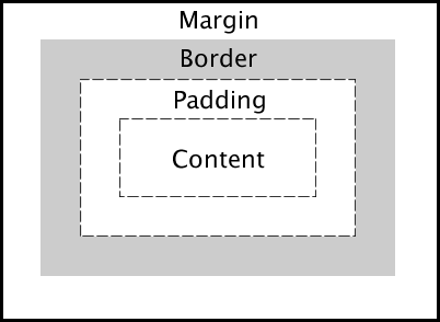
Important:
When you set the width and height properties of an element with CSS, you just set the width and height of the content area.
To calculate the total width and height of an element, we must also include the padding and borders.
div {
  width: 320px;
  height: 50px;
  padding: 10px;
  border: 5px solid gray;
  margin: 0;
}
This <div> element will have a total width of 350px and a total height of 80px.
Here is the calculation:
320px (width of content area)
-
20px (left padding + right padding)
-
10px (left border + right border)
= 350px (total width) 50px (height of content area)
50px (height of content area)
-
20px (top padding + bottom padding)
-
10px (top border + bottom border)
= 80px (total height)
-
The total width of an element should be calculated like this:
Total element width = width + left padding + right padding + left border + right border
-
The total height of an element should be calculated like this:
Total element height = height + top padding + bottom padding + top border + bottom border
Note:
The margin property also affects the total space that the box will take up on the page, but the margin is not included in the actual size of the box. The box's total width and height stops at the border.
Here are some common CSS properties used to define the box model:
- Content : width, height
- Padding : padding, padding-top, padding-right, padding-bottom, padding-left
- Border : border, border-width, border-style, border-color, border-top, border-right, border-bottom, border-left
- Margin : margin, margin-top, margin-right, margin-bottom, margin-left
CSS Border
CSS borders are used to define the borders around HTML elements.
CSS borders are used to define the borders around HTML elements. You can control the width, style, and color of borders. There are various properties to define borders in CSS. Let's explore these properties in detail with examples.
1. Border Style
The border-style property specifies the style of the border.
It can have up to four values for the top, right, bottom, and left sides.
none: No bordersolid: A solid borderdotted: A dotted borderdashed: A dashed borderdouble: A double bordergroove: A 3D grooved borderridge: A 3D ridged borderinset: A 3D inset borderoutset: A 3D outset borderhidden: A hidden border
Example:
div {
  border-style: solid;
}
p.dotted {
  border-style: dotted;
}
p.dashed {
  border-style: dashed;
}
p.solid {
  border-style: solid;
}
p.double {
  border-style: double;
}
p.groove {
  border-style: groove;
}
p.ridge {
  border-style: ridge;
}
p.inset {
  border-style: inset;
}
p.outset {
  border-style: outset;
}
p.none {
  border-style: none;
}
p.hidden {
  border-style: hidden;
}
p.mix {
  border-style: dotted dashed solid double;
}
2. Border Width
The border-width property sets the width of the border.
Example:
div {
  border-width: 2px;
}
It can have up to four values for the top, right, bottom, and left sides.
p.one {
  border-style: solid;
  border-width: 5px 20px; /* 5px top and bottom, 20px on the sides */
}

p.two {
  border-style: solid;
  border-width: 20px 5px; /* 20px top and bottom, 5px on the sides */
}

p.three {
  border-style: solid;
  border-width: 25px 10px 4px 35px; /* 25px top, 10px right, 4px bottom and 35px left */
}
3. Border Color
The border-color property sets the color of the border.
Example:
div {
  border-color: red;
}
Values: Supports named colors, hex values, RGB/RGBA, HSL/HSLA, inherit, and currentColor. It can have up to four values for the top, right, bottom, and left sides.
p.one {
  border-style: solid;
  border-color: red green blue yellow; /* red top, green right, blue bottom and yellow left */
}
4. Border Shorthand
The border property is a shorthand for setting the style, width, and color of the border in a single declaration.
Example:
div {
  border: 2px solid red;
}
5. Border Radius
The border-radius property is used to round the corners of the border.
Example:
div {
  border: 2px solid red;
  border-radius: 10px;
}
6. Individual Border Sides
You can set the border for individual sides using the following properties:
border-topborder-rightborder-bottomborder-left
Example:
div {
  border-top: 2px solid red;
  border-right: 4px dashed green;
  border-bottom: 2px solid blue;
  border-left: 4px dotted yellow;
}
If the border-style property has four values:
- border-style: dotted solid double dashed;
- top border is dotted
- right border is solid
- bottom border is double
- left border is dashed
If the border-style property has two values:
- border-style: dotted solid;
- top and bottom borders are dotted
- right and left borders are solid
If the border-style property has one value:
- border-style: dotted;
- all four borders are dotted
7. Border Collapse
The border-collapse property is used with table elements to specify whether table borders should collapse into a single border or be separated.
Values:
collapse: Borders are collapsed into a single border.separate: Borders are separated (default).
Example:
table {
  border-collapse: collapse;
}
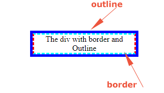
CSS Outline
An outline is a line drawn outside the element's border.Unlike border,outlines do not take up space and can be used to highlight elements without affecting their size or position.
Outline Style
The outline-style property specifies the style of the outline, and can have one of the following values:
- dotted:Defines a dotted outline
- dashed : Defines a dashed outline
- solid : Defines a solid outline
- double : Defines a double outline
- groove : Defines a 3D grooved outline
- ridge : Defines a 3D ridged outline
- inset : Defines a 3D inset outline
- outset : Defines a 3D outset outline
- none : Defines no outline
- hidden : Defines a hidden outline
p.dotted {
  outline-style: dotted;
}
p.dashed {
  outline-style: dashed;
}
p.solid {
  outline-style: solid;
}
p.double {
  outline-style: double;
}
p.groove {
  outline-style: groove;
}
p.ridge {
  outline-style: ridge;
}
p.inset {
  outline-style: inset;
}
p.outset {
  outline-style: outset;
}
outline-width
The outline-width specifies the thickness of the outline surrounding an element.
can be set using predefined values:
- thin: A predefined thin outline width.
- medium: A predefined medium outline width (default).
- thick: A predefined thick outline width.
- Length values: You can specify a specific width using units like px, em, rem, etc.
outline color
The outline-color property is used to set the color of the outline.
Example:
div {
  outline-color: gray;
}
Values: Supports named colors, hex values, RGB/RGBA, HSL/HSLA, inherit, and currentColor.
Shorthand Property
The outline shorthand property can be used to set the outline-width, outline-style(required), and outline-color in a single declaration.
selector {
  outline: width style color;
}
Example:
div {
  outline: 3px solid orange;
}
outline-offset
outline-offset Specifies the distance between the outline and the border or edge of an element.
Syntax
selector {
  outline-offset: value;
}
Accepted Values
- Length values: Can be specified using units like px, em, rem, %, etc.
.box {
  outline: 2px solid blue;
  outline-offset: 10px;
}
- Negative values: Moves the outline closer to or even inside the element.
.box {
  outline: 2px solid red;
  outline-offset: -5px;
}
CSS margin and padding
- Margin: Creates space around elements, outside of any defined borders.
- Padding: Creates space around the content inside an element, within any defined borders.
Margins
The margin property controls the space outside the border of an element. Margins can be set for each side of an element (top, right, bottom, left), or they can be set using the shorthand property.
Tip : Negative values are allowed.
Auto Margin: the browser calculates the margin
div {
  width: 50%;
  margin: auto;
}
value is commonly used for centering elements horizontally within their container.
Individual Margin Properties:
- margin-top
- margin-right
- margin-bottom
- margin-left
div {
  margin-top: 20px;
  margin-right: 15px;
  margin-bottom: 20px;
  margin-left: 15px;
}
Shorthand Property:
margin: [top] [right] [bottom] [left];

div {
  margin: 20px 15px 20px 15px;
}
Paddings
The padding property controls the space inside the border of an element, around the content. Padding can also be set for each side of an element (top, right, bottom, left), or it can be set using the shorthand property.
Tip : Negative values are allowed.
Individual Padding Properties:
- padding-top
- padding-right
- padding-bottom
- padding-left
div {
  padding-top: 20px;
  padding-right: 15px;
  padding-bottom: 20px;
  padding-left: 15px;
}
Shorthand Property:
padding: [top] [right] [bottom] [left];
div {
  padding: 20px 15px 20px 15px;
}
Margin and Padding Shorthand Notation
/* One value: */
margin: 20px; /* All four sides will have 20px margin */
padding: 15px; /* All four sides will have 15px padding */
/* Four values: */
margin: 20px 10px 5px 15px; /* Top 20px, right 10px, bottom 5px, left 15px */
padding: 15px 5px 10px 20px; /* Top 15px, right 5px, bottom 10px, left 20px */
CSS Height and Width
- Sets the height and width of an element.
- specifies the dimensions of an elements, whether they are block-level or inline-level elements.
- Setting the width of a
block-levelelement will prevent it from stretching out to the edges of its container.
selector {
  height: value;
  width: value;
}
Value Types:
- Auto: The default value. The browser calculates the height and width.
- Length Units : px, em, rem, etc.
- Percentage : Relative to the parent element’s dimensions.
- initial : Sets the height/width to its default value
- inherit : The height/width will be inherited from its parent value
- Viewport Units: vw (viewport width), vh (viewport height), vmin, vmax.
Tip :
The height and width properties do not include padding, borders, or margins! They set the height/width of the area inside the padding, border, and margin of the element!
div {
  height: 200px;
  width: 50%;
}
This sets thediv element to a height of 200 pixels and a width of 50% of its parent element's width.
Minimum and Maximum Dimensions
You can use the min-width, max-width, min-height, and max-height properties to set limits on the dimensions of an element.
- The max-width property is used to set the maximum width of an element.
- The max-height property is used to set the maximum height of an element.
If we for some reason use both the width property and the max-width property on the same element, and the value of the width property is larger than the max-width property; the max-width property will be used (and the width property will be ignored).
div.ex1 {
  width: 500px;
  margin: auto;
  border: 3px solid #73ad21;
}
/* Using tailwindcss play */
<div class="w-96 bg-red-600">div1</div>
<span class="bg-pink-500">span1</span>
<span class="bg-pink-900">span1</span>
<div class="w-9 bg-red-600">div2</div>
<span class="bg-pink-300">span3</span>
<!DOCTYPE html>
<html>
<head>
<style>
div.ex1 {
  width: 200px;
  border: 3px solid #73AD21;
}

div.ex2 {
  max-width: 400px;
  /* width:100%; By default it wants to take 100% width */
  min-width: 200px;
  border: 3px solid #73AD21;
}
</style>
</head>
<body>

<h2>CSS Max-width</h2>

<div class="ex1">This div element has width: 500px;</div>
<br>

<div class="ex2">This div element has max-width: 500px;</div>

<p><strong>Tip:</strong> Drag the browser window to smaller than 500px wide, to see the difference between
the two divs!</p>

</body>
</html>
Explanation:
- The first div has a fixed width of 200 pixels.
- The second div is flexible, adjusting its width between 200 and 400 pixels based on the browser window size.
using viewport Units:
.fullscreen {
  width: 100vw; /* 100% of the viewport width */
  height: 100vh; /* 100% of the viewport height */
  background-color: lightgreen;
}
Responsive Design
When designing for different screen sizes,percentages and viewport units are often used to create responsive layouts.
.responsive-container {
  width: 100%;
  max-width: 1200px;
  margin: 0 auto;
}

.responsive-box {
  width: 100%;
  height: auto; /* Adjusts height automatically based on content */
}
Example:
div {
  width: 50%;
  min-width: 200px;
  max-width: 600px;
  height: 300px;
  min-height: 100px;
  max-height: 500px;
}
This ensures that the div will have a width between 200px and 600px, and a height between 100px and 500px, regardless of other size settings.
CSS Text
CSS provides several properties to style text, control the appearance, alignment, spacing, decoration and transformation.
Text Color
color property is used to specify the color of the text.
Supports named colors, hex values, RGB/RGBA, HSL/HSLA, inherit, and currentColor.
color: value;
- Example:
p {
  color: red; /* Named color */
}
background Color
h1 {
  background-color: black;
  color: white;
}
Text Alignment
text-align property is used to set the horizontal alignment of a text.
text-align: left | right | center | justify;
left alignment is default,meaning text direction is left-to-right, and right alignment means text direction is right-to-left justify alignment means each line has equal width (like in newspapers and magazines).
- Example:
h1 {
  text-align: center;
}

h2 {
  text-align: left;
}

h3 {
  text-align: right;
}

h4 {
  text-align: justify;
}
Text Align Last
The text-align-last property specifies how to align the last line of a text.
Example
Align the last line of text in three <p> elements:
p.a {
  text-align-last: right;
}

p.b {
  text-align-last: center;
}

p.c {
  text-align-last: justify;
}
Text Direction
direction property in CSS specifies the text direction/writing direction of the content within an element.
selector {
  direction: ltr | rtl;
}
- ltr: Left to right (default). Common for languages like English, French, German, etc.
- rtl: Right to left. Common for languages like Arabic, Hebrew, etc.
Bidirectional Text Support
Text containing both left-to-right and right-to-left elements.
for this unicode-bidi property is used with following values:
- normal: Default behavior.
- embed: Embeds the element in the specified direction, making it isolated from its surroundings.
- bidi-override: Forcibly overrides the text direction within the element.
The unicode-bidi property works with the direction property to handle the directionality of text.
Text Decoration
Text-decoration-line
text-decoration-line property sets the kind of decoration line(s) that are added to the text.
text-decoration-line: none | underline | overline | line-through | blink;
- none: No decoration is added.
- underline: Adds an underline beneath the text.
- overline: Adds a line above the text.
- line-through: Adds a line through the middle of the text.
- blink: Makes the text blink (deprecated and not recommended for use). All links in HTML are underlined by default.
text-decoration-color
text-decoration-color property is used to set the color of the decoration line.
Supports named colors, hex values, RGB/RGBA, HSL/HSLA, inherit, and currentColor.
p.color {
  text-decoration: underline;
  text-decoration-color: red;
}
text-decoration-style
text-decoration-style property is used to set the style of the decoration line.
(solid, dotted, dashed, wavy, double).
p.style {
  text-decoration: underline;
  text-decoration-style: wavy;
}
text-decoration-thickness
text-decoration-thickness property is used to set the thickness of the decoration line.
p.thickness {
  text-decoration: underline;
  text-decoration-thickness: 2px;
}
The Shorthand Property
The text-decoration property is a shorthand property for:
- text-decoration-line (required)
- text-decoration-color (optional)
- text-decoration-style (optional)
- text-decoration-thickness (optional)
p {
  text-decoration-line: underline;
  text-decoration-color: red;
  text-decoration-style: double;
  text-decoration-thickness: 5px;
}
/* instead of above  code use the following shorthand property code */
p {
  text-decoration: underline red double 5px;
}
Text Transformation
text-transform property is used to specify uppercase and lowercase letters in a text or
capitalize the first letter of each word.i.e. it controls the capitalization of text
text-transform: none | capitalize | uppercase | lowercase;
- Example:
p.uppercase {
  text-transform: uppercase;
}

p.lowercase {
  text-transform: lowercase;
}

p.capitalize {
  text-transform: capitalize;
}
Text Spacing
- text-indent
- letter-spacing
- line-height
- word-spacing
- white-space
Text Indentation
text-indent property is used to specify the indentation of the first line of a text
text-indent: value;
- Example:
p {
  text-indent: 50px;
}
Letter Spacing
letter-spacing property is used to specify the space between the characters in a text.
letter-spacing: value;
- Example:
p {
  letter-spacing: 2px;
}

h2 {
  letter-spacing: -2px;
}
Word Spacing
word-spacing property is used to specify the space between the words in a text.
word-spacing: value;
- Example:
p {
  word-spacing: 10px;
}
Text Shadow
text-shadow: h-shadow v-shadow blur-radius color;
- Example:
h1 {
  text-shadow: 2px 2px 5px gray;
}
Line Height
line-height property is used to specify the space between lines above and below text
line-height: value;
- Example:
p {
  line-height: 1.5;
}
Text Overflow
text-overflow: clip | ellipsis | string;
- Example:
div {
  width: 150px;
  white-space: nowrap;
  overflow: hidden;
  text-overflow: ellipsis;
}
White Space
white-space property specifies how white-space inside an element is handled.
white-space: normal | nowrap | pre | pre-line | pre-wrap;
Values
-
normal : Default behavior for most elements. Useful for regular text content. Text wraps to fit the container.
-
nowrap : Useful for creating single-line text fields or preventing text wrapping in buttons or navigation bars. Text continues on the same line until a
<br>tag or line break is encountered. -
pre: White space is preserved by the browser. Text does not wrap unless explicit line breaks are added. text are displayes as written in code without ignoring space,tabs.Useful for displaying preformatted text, such as code blocks.
-
pre-line : Sequences of white space are collapsed into a single space. Same like pre but Text wraps to fit the container.
-
pre-wrap : White space is preserved by the browser. Text wraps to fit the container.Great for chat messages or poetry.
-
Example:
<!DOCTYPE html>
<html lang="en">
  <head>
    <title>White Space Example</title>
    <style>
      .normal {
        white-space: normal;
        border: 1px solid black;
        padding: 10px;
        margin-bottom: 10px;
      }
      .nowrap {
        white-space: nowrap;
        border: 1px solid black;
        padding: 10px;
        margin-bottom: 10px;
      }
      .pre {
        white-space: pre;
        border: 1px solid black;
        padding: 10px;
        margin-bottom: 10px;
      }
      .pre-line {
        white-space: pre-line;
        border: 1px solid black;
        padding: 10px;
        margin-bottom: 10px;
      }
      .pre-wrap {
        white-space: pre-wrap;
        border: 1px solid black;
        padding: 10px;
        margin-bottom: 10px;
      }
    </style>
  </head>
  <body>
    <div class="normal">
      This is an example text with multiple spaces. This is a new line.
    </div>
    <div class="nowrap">
      This is an example text with multiple spaces. This is a new line.
    </div>
    <div class="pre">
      This is an example text with multiple spaces. This is a new line.
    </div>
    <div class="pre-line">
      This is an example text with multiple spaces. This is a new line.
    </div>
    <div class="pre-wrap">
      This is an example text with multiple spaces. This is a new line.
    </div>
  </body>
</html>
Vertical Alignment
vertical-align: baseline | sub | super | top | text-top | middle | bottom |
  text-bottom | length | percentage;
- Example:
img {
  vertical-align: middle;
}
Text Shadow
text-shadow property adds shadow effect to text.
h1 {
  text-shadow: 2px 2px;
}
h2 {
  text-shadow: 2px 2px red;
}
h3 {
  text-shadow: 2px 2px 5px red;
  /* add a blur effect (5px) to the shadow */
}
h4 {
  color: white;
  text-shadow: 1px 1px 2px black, 0 0 25px blue, 0 0 5px darkblue;
}
Font Properties (Related to Text Styling)
Font Family
font-family property sets typeface to be used for text.
font-family: "font1", "font2", ...;
- Example:
p {
  font-family: "Arial", "Helvetica", sans-serif;
}
Tip
It is very important to always use fallback fonts. This means that you should add a list of similar "backup fonts" in the font-family property. If the first font does not work, the browser will try the next one, and the next one, and so on.
Font Size
font-size property sets the size of the font.
font-size: value;
- Example:
selector {
  font-size: 16px; /* Can also use em, rem, %, etc. */
}
Responsive Font Size
The text size can be set with a vw unit, which means the "viewport width".
<h1 style="font-size:10vw">Hello World</h1>
Viewport is the browser window size. 1vw = 1% of viewport width. If the viewport is 50cm wide, 1vw is 0.5cm.
Font Style
font-style property sets the style of the font (e.g., italic or oblique).
font-style: normal | italic | oblique;
- Example:
p {
  font-style: italic;
}
Font Weight
font-weight property sets the thickness of the font.
font-weight: normal | bold | bolder | lighter | number;
- Example:
p {
  font-weight: bold;
  /* Can also use numeric values like 400, 700, etc. */
}
Font Variant
font-variant property specifies whether or not a text should be displayed in a small-caps font.
font-variant: normal | small-caps;
In a small-caps font, all lowercase letters are converted to uppercase letters. However, the converted uppercase letters appears in a smaller font size than the original uppercase letters in the text.
- Example:
p {
  font-variant: small-caps;
}
Use Google Fonts
Just add a special style sheet link in the <head> section and then refer to the font in the CSS.
<head>
<link rel="stylesheet" href="https://fonts.googleapis.com/css?family=Sofia">
<style>
body {
  font-family: "Sofia", sans-serif;
}
</style>
</head>
Use Multiple Google Fonts
To use multiple Google fonts, just separate the font names with a pipe character (|), like this:
<head>
<link rel="stylesheet" href="https://fonts.googleapis.com/css?family=Audiowide|Sofia|Trirong">
<style>
h1.a {font-family: "Audiowide", sans-serif;}
h1.b {font-family: "Sofia", sans-serif;}
h1.c {font-family: "Trirong", serif;}
</style>
</head>
Font Shorthand
The font property is a shorthand property for:
- font-style
- font-variant
- font-weight
- font-size/line-height(required)
- font-family(required)
font: font-style font-variant font-weight font-size/line-height font-family;
- Example:
p.a {
  font: 20px Arial, sans-serif;
}
p.b {
  font: italic small-caps bold 16px/1.5 "Arial", sans-serif;
}
CSS List
CSS provides several properties for styling HTML lists.
These properties allow to control the appearance of both ordered (<ol>) and
unordered (<ul>) lists, as well as their items (<li>)
1. list-style-type
The list-style-type property specifies the type of marker (bullet or number) to be used for list items.
Values: disc: The default marker for unordered lists (a filled circle). circle: An unfilled circle. square: A filled square. none: No marker. decimal: The default marker for ordered lists (numbers). decimal-leading-zero: Numbers with leading zeros (01, 02, 03, etc.). lower-roman: Lowercase Roman numerals (i, ii, iii, etc.). upper-roman: Uppercase Roman numerals (I, II, III, etc.). lower-alpha: Lowercase letters (a, b, c, etc.). upper-alpha: Uppercase letters (A, B, C, etc.).
<!DOCTYPE html>
<html lang="en">
<head>
    <meta charset="UTF-8">
    <meta name="viewport" content="width=device-width, initial-scale=1.0">
    <title>List Style Type Example</title>
    <style>
        .disc {
            list-style-type: disc;
        }
        .circle {
            list-style-type: circle;
        }
        .square {
            list-style-type: square;
        }
        .decimal {
            list-style-type: decimal;
        }
        .lower-roman {
            list-style-type: lower-roman;
        }
    </style>
</head>
<body>
    <ul class="disc">
        <li>Item 1</li>
        <li>Item 2</li>
        <li>Item 3</li>
    </ul>
    <ul class="circle">
        <li>Item 1</li>
        <li>Item 2</li>
        <li>Item 3</li>
    </ul>
    <ul class="square">
        <li>Item 1</li>
        <li>Item 2</li>
        <li>Item 3</li>
    </ul>
    <ol class="decimal">
        <li>Item 1</li>
        <li>Item 2</li>
        <li>Item 3</li>
    </ol>
    <ol class="lower-roman">
        <li>Item 1</li>
        <li>Item 2</li>
        <li>Item 3</li>
    </ol>
</body>
</html>
2. list-style-image
list-style-image property specifies an image as the list item marker.
<head>
    <title>List Style Image Example</title>
    <style>
        .custom-marker {
            list-style-image: url('marker.png'); /* Replace 'marker.png' with your image URL */
        }
    </style>
</head>
<body>
    <ul class="custom-marker">
        <li>Item 1</li>
        <li>Item 2</li>
        <li>Item 3</li>
    </ul>
</body>
</html>
3. list-style-position
The list-style-position property specifies the position of the list-item markers (bullet points).
Values:
- outside: The marker is outside the list item (default).
- inside: The marker is inside the list item.
<head>
    <title>List Style Position Example</title>
    <style>
        .outside {
            list-style-position: outside;
        }
        .inside {
            list-style-position: inside;
        }
    </style>
</head>
<body>
    <ul class="outside">
        <li>Item 1</li>
        <li>Item 2</li>
        <li>Item 3</li>
    </ul>
    <ul class="inside">
        <li>Item 1</li>
        <li>Item 2</li>
        <li>Item 3</li>
    </ul>
</body>
</html>
Shorthand List Property
The list-style property is a shorthand for setting
- list-style-type,
- list-style-position, and
- list-style-image in one declaration.
selector {
  list-style: list-style-type list-style-position list-style-image;
}
Example:
 .custom-list {
  list-style: square inside url('marker.png');
}

 ```
 #### Note
 the list also has default margin and padding.`list-style-type:none` property can also be
 used to remove the markers/bullets.

 ```css
 ul {
  list-style-type: none;
  margin: 0;
  padding: 0;
}
```

#### Styling List With Colors

```css
ol {
  background: #ff9999;
  padding: 20px;
}

ul {
  background: #3399ff;
  padding: 20px;
}

ol li {
  background: #ffe5e5;
  color: darkred;
  padding: 5px;
  margin-left: 35px;
}

ul li {
  background: #cce5ff;
  color: darkblue;
  margin: 5px;
}
```


### CSS Tables
CSS provides several properties for styling HTML tables.
These properties allow to control the appearance of able elements, such as borders, padding, text alignment, and more.

### CSS Properties for Tables

#### 1. `border`

The `border` property is used to set the borders for the table, rows, and cells.

```css
table, th, td {
  border: 1px solid black;
}
```

#### 2. `border-collapse`

The `border-collapse` property specifies whether table borders should be collapsed into a single border or separated as in standard HTML.

```css
table {
  border-collapse: collapse;
}
```
Example
```css
<!DOCTYPE html>
<html>
<head>
<style>
table, td, th {
  border: 1px solid pink;
}

table {
  width: 100%;
  border-collapse: collapse;
}
</style>
</head>
<body>

<h2>Let the table borders collapse</h2>

<table>
  <tr>
    <th>Firstname</th>
    <th>Lastname</th>
  </tr>
  <tr>
    <td>Apsara/td>
    <td>Astriya</td>
  </tr>
  <tr>
    <td>Bishwokarma</td>
    <td>Sunar</td>
  </tr>
</table>
</body>
</html>
```

#### 3.Table Style

 - `padding`

The `padding` property adds padding inside the table cells.

```css
th, td {
  padding: 10px;
}
```
- Horizontal Dividers
Add the border-bottom property to <th> and <td> for horizontal dividers:
```css
th, td {
  border-bottom: 1px solid red;
}
```
- Hoverable Table
Use the :hover selector on `<tr>` to highlight table rows on mouse over
```css
tr:hover {background-color: blue;}
```
- Striped Tables
For zebra-striped tables, use the nth-child() selector and add a background-color to all even (or odd) table rows:
```Css
tr:nth-child(even)
 {background-color: black;}

 ```


#### 4. `text-align`

The `text-align` property sets the horizontal alignment of text in the table cells.

```css
th, td {
  text-align: left; /* Can be left, center, or right */
}
```

#### 5. `width` and `height`

The `width` and height property sets the width and height of the table and its cells.

```css
table {
  width: 100%;
}
th, td {
  width: 33%; /* Distribute columns evenly */

}
 th {
  height: 70px;
}
```
 #### 6. Table Color
It specifies the background color and text color of elements in table.
`background-color` property Sets the background color for the table, rows, or cells.

here, The example below specifies the background color and text color of <th> elements:
```css
th {
  background-color: #f2f2f2;
  color: white;
}
tr:nth-child(even) {
  background-color: #f9f9f9;
}

```
-`background-color`

The `background-color` property sets the background color for the table, rows, or cells.

```css
th {
  background-color: #f2f2f2;
}
tbody tr:nth-child(even) {
  background-color: #f9f9f9;
}
```

#### 7. `caption-side`
The `caption-side` property sets the position of the table caption.

```css
caption {
  caption-side: top; /* Can be top or bottom */
}
```

#### Additional CSS Properties for Advanced Styling

- border-spacing: Specifies the distance between the borders of adjacent cells.
```css
table {
  border-spacing: 10px;
}
```
- empty-cells: Controls whether or not to display borders and background on empty cells.
```css
table {
  empty-cells: show; /* Can be hide or show */
}
```

table-layout: Sets the algorithm used to lay out the table cells, rows, and columns.

```css
table {
  table-layout: fixed; /* Can be auto or fixed */
}
```

#### CSS Responsive Table

A responsive table will display a horizontal scroll bar if the screen is too small to display the full content.
- Wrap in a div with overflow-x: auto: Simple and effective, adds a horizontal scrollbar for overflow content.
- Use CSS media queries: Adjust the table layout for different screen sizes, especially for mobile devices.
- Use Flexbox: For a more complex layout, though it's less semantically correct for tabular data.

1. Wrapping the Table in a Div with Overflow
One of the simplest methods is to wrap the table in a div with overflow-x: auto.
This method adds a horizontal scroll bar to the table when it's too wide for its container.
```css
<!DOCTYPE html>
<html lang="en">
<head>
    <title>Responsive Table</title>
    <style>
        .table-container {
            overflow-x: auto;
            margin: 20px 0;
        }
        table {
            width: 100%;
            border-collapse: collapse;
            min-width: 600px; /* Minimum width to demonstrate scrolling */
        }
        th, td {
            border: 1px solid #ddd;
            padding: 8px;
            text-align: left;
        }
        th {
            background-color: #f2f2f2;
        }
    </style>
</head>
<body>
    <div class="table-container">
        <table>
            <thead>
                <tr>
                    <th>Header 1</th>
                    <th>Header 2</th>
                    <th>Header 3</th>

                </tr>
            </thead>
            <tbody>
                <tr>
                    <td>Data 1</td>
                    <td>Data 2</td>
                    <td>Data 3</td>

                </tr>
                <tr>
                    <td>Data 5</td>
                    <td>Data 6</td>
                    <td>Data 7</td>
                </tr>
            </tbody>
        </table>
    </div>
</body>
</html>
```
2. Using CSS Media Queries
Another approach involves using CSS media queries to adjust the table's layout for different screen sizes.
```css
<!DOCTYPE html>
<html lang="en">
<head>
    <title>Responsive Table with Media Queries</title>
    <style>
        table {
            width: 100%;
            border-collapse: collapse;
        }
        th, td {
            border: 1px solid #ddd;
            padding: 8px;
            text-align: left;
        }
        th {
            background-color: #f2f2f2;
        }

        @media screen and (max-width: 600px) {
            table, thead, tbody, th, td, tr {
                display: block;
            }
            thead tr {
                display: none;
            }
            tr {
                margin-bottom: 15px;
            }
            td {
                display: block;
                text-align: right;
                padding-left: 50%;
                position: relative;
            }
            td::before {
                content: attr(data-label);
                position: absolute;
                left: 0;
                width: 50%;
                padding-left: 15px;
                font-weight: bold;
                text-align: left;
            }
        }
    </style>
</head>
<body>
    <table>
        <thead>
            <tr>
                <th>Header 1</th>
                <th>Header 2</th>
                <th>Header 3</th>

            </tr>
        </thead>
        <tbody>
            <tr>
                <td data-label="Header 1">Data 1</td>
                <td data-label="Header 2">Data 2</td>
                <td data-label="Header 3">Data 3</td>

            </tr>
            <tr>
                <td data-label="Header 1">Data 5</td>
                <td data-label="Header 2">Data 6</td>
                <td data-label="Header 3">Data 7</td>

            </tr>
        </tbody>
    </table>
</body>
</html>
```

3. Responsive Table with Flexbox
Using Flexbox for table layout is another method, though it involves more complex CSS and may not be semantically correct for tabular data. Here’s an example:

```css
<!DOCTYPE html>
<html lang="en">
<head>
    <title>Responsive Table with Flexbox</title>
    <style>
        .table-container {
            display: flex;
            flex-direction: column;
            width: 100%;
        }
        .table-row {
            display: flex;
            flex-direction: row;
            border-bottom: 1px solid #ddd;
        }
        .table-cell {
            flex: 1;
            padding: 8px;
            text-align: left;
        }
        .table-header {
            background-color: #f2f2f2;
        }

        @media screen and (max-width: 600px) {
            .table-row {
                flex-direction: column;
                border: none;
            }
            .table-cell {
                padding-left: 50%;
                position: relative;
                text-align: right;
                border-bottom: 1px solid #ddd;
            }
            .table-cell::before {
                content: attr(data-label);
                position: absolute;
                left: 0;
                width: 50%;
                padding-left: 15px;
                font-weight: bold;
                text-align: left;
            }
        }
    </style>
</head>
<body>
    <div class="table-container">
        <div class="table-row table-header">
            <div class="table-cell">Header 1</div>
            <div class="table-cell">Header 2</div>
            <div class="table-cell">Header 3</div>

        </div>
        <div class="table-row">
            <div class="table-cell" data-label="Header 1">Data 1</div>
            <div class="table-cell" data-label="Header 2">Data 2</div>
            <div class="table-cell" data-label="Header 3">Data 3</div>

        </div>
        <div class="table-row">
            <div class="table-cell" data-label="Header 1">Data 5</div>
            <div class="table-cell" data-label="Header 2">Data 6</div>
            <div class="table-cell" data-label="Header 3">Data 7</div>
        </div>
    </div>
</body>
</html>
```


### CSS display-CSS Layout

It specifies the display behavior (the type of rendering box) of an element.
i.e. `display` property in CSS is used to control how an element is displayed on the web page.
The default display value for most elements is block or inline.

`display` property has following various values:


#### 1. `block`
- The element takes up the full width available.
- Starts on a new line.
- Examples of block-level elements:

- `<div>`
- `<h1> - <h6>`
- `<p>`
- `<form>`
- `<header>`
- `<footer>`
- `<section>`

```css
div {
  background : red;
  display: block;
}
```

#### 2. `inline`
- The element takes up only as much width as it needs.
- Does not start on a new line .
- Examples of inline elements:

- `<span>`
- `<a>`
- `<img>`

```css
span {
  background : red;
  display: inline;
}
```


#### 3. `none`
- The element is not displayed at all; the element is completely removed from the page layout.
- It doesn't take up any space.
- `display: none;` is commonly used with JavaScript to hide and show elements without deleting and recreating them.

```css
div {
  background : red;
  display: none;
}
```

#### 4. `inline-block`
- An `inline-block` element is similar to an inline element, Does not start on a new line.
- The element takes up only as much width as it needs, like `inline`.
- But it can have a width and height like `block`.
- display: inline-block does not add a line-break after the element, so the element can sit next to other elements.
```css
div {
  background : red;
  display: inline-block;
}
```
#### 5. `flex`
- The element becomes a flex container, allowing for flexible layouts.
- Its children (flex items) can be arranged in horizontal or vertical directions.
- Takes up the full width available by default like block.
- i.e Creates a flexible container for arranging children in rows and columns.


```css
div {
  background : red;
  display: flex;
}
```

#### 6. `inline-flex`
- An `inline flex ` Behaves like `flex` but acts like an `inline` element.
- Takes only as much width as needed, like inline.


```css
div {
  background : red;
  display: inline-flex;
}
```

#### 7. `grid`
- The element becomes a grid container, enabling a grid-based layout.
- Its children (grid items) can be placed into rows and columns.
- Takes up the full width available by default.
- i.e Creates a grid container for arranging children in rows and columns.


```css
div {
  background : red;
  display: grid;
}
```

#### 8. `inline-grid`
- An `inline grid` Behaves like grid but acts as an inline element.
- Takes only as much width as needed, like inline.
```css
div {
  background : red;
  display: inline-grid;
}
```

#### 9. `table`
A table element, behaving like a `<table>` element.

```css
div {
  display: table;
}
```

#### 10. `table-row`
A table row element, behaving like a `<tr>` element.

```css
div {
  display: table-row;
}
```

#### 11. `table-cell`
A table cell element, behaving like a `<td>` element.

```css
div {
  display: table-cell;
}
```

#### 12. `list-item`
A list item element, behaving like a `<li>` element.

```css
div {

  display: list-item;
}
```

### Example Usage of Various Display Properties

```html
<!DOCTYPE html>
<html lang="en">
<head>

    <title>CSS Display Property</title>
    <style>
        .block {
            display: block;
            background-color: lightblue;
            margin: 10px 0;
        }
        .inline {
            display: inline;
            background-color: lightgreen;
            margin: 10px;
        }
        .inline-block {
            display: inline-block;
            background-color: lightcoral;
            margin: 10px;
        }
        .none {
            display: none;
        }
        .flex {
            display: flex;
            background-color: lightgoldenrodyellow;
            margin: 10px 0;
        }
        .grid {
            display: grid;
            grid-template-columns: 1fr 1fr;
            background-color: lightpink;
            margin: 10px 0;
        }
    </style>
</head>
<body>
    <div class="block">Block Element</div>
    <span class="inline">Inline Element</span>
    <span class="inline">Inline Element</span>
    <div class="inline-block">Inline-Block Element</div>
    <div class="inline-block">Inline-Block Element</div>
    <div class="flex">
        <div>Flex Item 1</div>
        <div>Flex Item 2</div>
        <div>Flex Item 3</div>
    </div>
    <div class="grid">
        <div>Grid Item 1</div>
        <div>Grid Item 2</div>
    </div>
    <div class="none">This element is hidden with display: none</div>
</body>
</html>
```


### CSS Position Property

`position property` in CSS is used to specify the type of positioning method used for an element.
It affects how the element is positioned within its container and how it interacts with other elements on the page.

There are five different position values:
- static
- relative
- fixed
- absolute
- sticky

Elements are then positioned using the top, bottom, left, and right properties.


#### position: static
- Default value: Elements are positioned according to the normal document flow.
- Static positioned elements are not affected by the Position properties (top, bottom, left, and right properties).

```css
<!DOCTYPE html>
<html>
<head>
<style>
div.static {
  position: static;
  border: 3px solid #73AD21;
}
</style>
</head>
<body>

<h2>position: static;</h2>

<p>An element with position: static; </p>

<div class="static">
This div element has position: static;
</div>

</body>
</html>


```

#### position: relative

- The element is positioned relative to its original position.
- Position properties (top, right, bottom, left) will offset the element from its original position.

```css

div {
  position: relative;
  top: 10px;  /* Moves the element 10px down from its original position */
  left: 20px; /* Moves the element 20px to the right from its original position */
}

<!DOCTYPE html>
<html>
<head>
<style>
div.relative {
  position: relative;
  left: 30px;
  border: 2px solid red;
}
</style>
</head>
<body>

<h2>position: relative;</h2>

<p>An element with position: relative;</p>

<div class="relative">
This div element has position: relative;
</div>

</body>
</html>

#### postion: absolute
- Relative to the nearest positioned ancestor (instead of positioned relative to the viewport, like fixed).
- However; if an absolute positioned element has no positioned ancestors, it uses the document body, and moves along with page scrolling.
- Position properties (top, right, bottom, left) are used to specify the position.
```css
div {
  position: absolute;
  top: 50px;   /* Moves the element 50px down from the top of the positioned ancestor */
  left: 100px; /* Moves the element 100px to the right from the left of the positioned ancestor */
}

```
#### position: fixed
- Relative to the viewport: The element is positioned relative to the browser window.
- It stays in the same place even when the page is scrolled.
- Position properties (top, right, bottom, left) are used to specify the position.

```css
div {
  position: fixed;
  top: 10px;  /* Moves the element 10px down from the top of the viewport */
  right: 0;   /* Moves the element to the right edge of the viewport */
}
```
stays fixed during scrolling.

#### position: sticky
- Hybrid between relative and fixed: The element is positioned relative until a given offset position is met in the viewport(based on the user's scroll position), then it "sticks" in place like fixed.
- i.e.Acts like relative until it reaches a specified point, then acts like fixed.
- Position properties (top, right, bottom, left) are used to specify the sticky position.

```css
div {
  position: sticky;
  top: 0;  /* Sticks the element to the top of the viewport when scrolling down */
}
<!DOCTYPE html>
<html>
<head>
<style>
div.sticky {
  position: -webkit-sticky;
  position: sticky;
  top: 0;
  padding: 5px;
  background-color: #cae8ca;
  border: 2px solid #4CAF50;
}
</style>
</head>
<body>
<div class="sticky">I am sticky!</div>
<div>
  <p>In this example, the sticky element sticks to the top of the page (top: 0), when you reach its scroll position.</p>
</div>

</body>
</html>
```

### Z- index
When elements are positioned, they can overlap other elements.
The z-index property controls the stack order of an element (which element should be placed in front of, or behind, the others).
- An element with a higher `z-index` value will be positioned in front of an element with a lower `z-index` value.
  Here's a detailed explanation:

### Key Points about `z-index`

1. **Only Affects Positioned Elements**: `z-index` works only on elements that have their `position` set to `relative`, `absolute`, `fixed`, or `sticky`.

2. **Integer Values**: `z-index` accepts integer values (positive, negative, or zero). Higher values are stacked above lower values.

3. **Default Value**: The default `z-index` value is `auto`, which means the element inherits the stacking order from its parent.

4. **Stacking Context**: A stacking context is formed when an element is positioned and has a `z-index` value other than `auto`.
 Child elements within this context are stacked according to their `z-index` values relative to the parent stacking context.

### Examples of `z-index`

Here is an HTML example with CSS demonstrating how `z-index` works:

```html
<!DOCTYPE html>
<html lang="en">
<head>
  <title>CSS z-index Property</title>
  <style>
    .container {
      position: relative;
      height: 200px;
      background-color: lightgray;
    }
    .box1 {
      position: absolute;
      top: 50px;
      left: 50px;
      width: 100px;
      height: 100px;
      background-color: lightblue;
      z-index: 1;
    }
    .box2 {
      position: absolute;
      top: 70px;
      left: 70px;
      width: 100px;
      height: 100px;
      background-color: lightgreen;
      z-index: 2;
    }
    .box3 {
      position: absolute;
      top: 90px;
      left: 90px;
      width: 100px;
      height: 100px;
      background-color: lightcoral;
      z-index: 3;
    }
  </style>
</head>
<body>

<h2>CSS z-index Property</h2>

<div class="container">
  <div class="box1">Box 1</div>
  <div class="box2">Box 2</div>
  <div class="box3">Box 3</div>
</div>

</body>
</html>
```

### Explanation of the Example

1. **Container**:
   - The `container` div is relatively positioned to establish a context for the absolutely positioned child elements.

2. **Box 1**:
   - Positioned absolutely within the `container`.
   - Has a `z-index` of `1`, so it is behind the other boxes.

3. **Box 2**:
   - Positioned absolutely within the `container`.
   - Has a `z-index` of `2`, so it is in front of Box 1 but behind Box 3.

4. **Box 3**:
   - Positioned absolutely within the `container`.
   - Has a `z-index` of `3`, so it is in front of both Box 1 and Box 2.


### CSS Overflow

The `overflow` property is used to control what happens to content that overflows an element's box.
I.e. it specifies whether to clip the content or to add scrollbars when the content of an element is too big to fit in the specified area.

The `overflow` property can be set to one of the following values:

### Values of `overflow`

1. **`visible`** (default)
   - Content that overflows the container is not clipped and is rendered outside the element's box.
   - This is the default behavior.

   ```css
   div {
     overflow: visible;
   }
   ```

2. **`hidden`**
   - Content that overflows the container is clipped and not visible.
   - No scrollbars are provided to view the hidden content.

   ```css
   div {
     overflow: hidden;
   }
   ```

3. **`scroll`**
   - Content that overflows the container is clipped.
   - Scrollbars are provided inside the box, allowing the user to scroll to see the hidden content.
   - The container has scrollbars even if the content does not overflow.
   ```css
   div {
     overflow: scroll;
   }
   ```
Note that this will add a scrollbar both horizontally and vertically (even if you do not need it)
4. **`auto`**
   - Content that overflows the container is clipped.
   - Scrollbars are provided only if necessary (i.e., if the content overflows).

   ```css
   div {
     overflow: auto;
   }
   ```

### Individual Overflow Properties

- **`overflow-x`**: Controls the horizontal overflow.
- **`overflow-y`**: Controls the vertical overflow.

These properties allow for more granular control:

```css
div {
  overflow-x: hidden; /* Hide horizontal overflow */
  overflow-y: scroll; /* Show vertical scrollbar if needed */
}
```

`overflow-wrap`	Specifies whether or not the browser can break lines with long words, if they overflow its container

### CSS Float

The `float` property in CSS is used to position an element to the left or right of its container,e.g. let an image float left to the text in a container
allowing text and inline elements to wrap around it. It was commonly used for creating layouts before the
introduction of Flexbox and Grid, but it is still useful for specific scenarios like wrapping text around images.

### Values of `float`

1. **`left`**
   - The element floats to the left of its container.
   - Text and inline elements will wrap around the right side of the floated element.

   ```css
   .float-left {
     float: left;
   }
   ```

2. **`right`**
   - The element floats to the right of its container.
   - Text and inline elements will wrap around the left side of the floated element.

   ```css
   .float-right {
     float: right;
   }
   ```

3. **`none`** (default)
   - The element does not float.
   - It remains in the normal flow of the document.

   ```css
   .no-float {
     float: none;
   }
   ```

4. **`inherit`**
   - The element inherits the `float` value from its parent.

   ```css
   .inherit-float {
     float: inherit;
   }
   ```

### Clearing Floats
`clear` property specifies what should happen with the element that is next to a floating element.
Values of `clear`:
- **`left`**: No floating elements allowed on the left side.
- **`right`**: No floating elements allowed on the right side.
- **`both`**: No floating elements allowed on either side.
- **`none`**: Default value, allows floating elements on both sides.

```css
.clear-left {
  clear: left;
}

.clear-right {
  clear: right;
}

.clear-both {
  clear: both;
}
```

### Example

Here's an example demonstrating how to use the `float` and `clear` properties:

```html
<!DOCTYPE html>
<html lang="en">
<head>
  <meta charset="UTF-8">
  <meta name="viewport" content="width=device-width, initial-scale=1.0">
  <title>CSS Float Property</title>
  <style>
    .container {
      width: 600px;
      border: 1px solid #000;
      padding: 10px;
    }

    .box {
      width: 200px;
      height: 100px;
      margin: 10px;
    }

    .float-left {
      float: left;
      background-color: lightblue;
    }

    .float-right {
      float: right;
      background-color: lightgreen;
    }

    .clear-both {
      clear: both;
    }

    .text {
      background-color: lightgray;
      padding: 5px;
    }
  </style>
</head>
<body>

<h2>CSS Float Property</h2>

<div class="container">
  <div class="box float-left">Float Left</div>
  <div class="box float-right">Float Right</div>
  <div class="text">
    This is some text that will wrap around the floated elements. It will wrap around both the floated elements on the left and right.
  </div>
  <div class="clear-both"></div>
  <div class="text">
    This text is below the cleared floats. It will not wrap around the floated elements.
  </div>
</div>

</body>
</html>
```

### Explanation of the Example

1. **Container**:
   - The `.container` element sets a boundary for the floated elements with a width and border.

2. **Float Left**:
   - The `.box.float-left` element floats to the left. Other content will wrap around its right side.

3. **Float Right**:
   - The `.box.float-right` element floats to the right. Other content will wrap around its left side.

4. **Text Wrapping**:
   - The `.text` element demonstrates how text wraps around floated elements. The first `.text` element wraps around the floated boxes.

5. **Clearing Floats**:
   - The `.clear-both` element clears the float on both sides, ensuring that the following content starts below the floated elements.

6. **Unwrapped Text**:
   - The second `.text` element is placed after the clearing element, so it does not wrap around the floated boxes.


### CSS Layout - Horizontal & Vertical Align
- Center elements horizontally
##### Center Align Elements
- To horizontally center a block element (like <div>), use margin: auto;
Note: Center aligning has no effect if the width property is not set (or set to 100%).

```
.center {
  margin: auto;
  width: 50%;
  border: 3px solid green;
  padding: 10px;
}

```


##### Center Align Text

- To just center the text inside an element, use text-align: center;

```css
.center {
  text-align: center;
  border: 3px solid green;
}
```

##### Center an Image
- To center an image, set left and right margin to auto and make it into a block element.

```css
img {
  display: block;
  margin-left: auto;
  margin-right: auto;
  width: 40%;
}
```


#### Left and Right Align - Using position

- One method for aligning elements is to use position: absolute;
```CSS
.right {
  position: absolute;
  right: 0px;
  width: 300px;
  border: 3px solid #73AD21;
  padding: 10px;
}
```
#### Left and Right Align - Using float
Another method for aligning elements is to use the float property:

```CSS
.right {
  float: right;
  width: 300px;
  border: 3px solid #73AD21;
  padding: 10px;
}

```

- Center vertically.
##### Using padding
```css
.center {
  padding: 70px 0;
  border: 3px solid green;
}
```
##### Center Vertically - Using Flexbox
```css
.center {
  display: flex;
  justify-content: center;
  align-items: center;
  height: 200px;
  border: 3px solid green;
}
```


To center both vertically and horizontally, use padding and text-align: center:
```css.center {
  padding: 70px 0;
  border: 3px solid green;
  text-align: center;
}
```

CSS provides several ways to align elements both horizontally and vertically. Here's a comprehensive guide on how to achieve various alignment tasks using different CSS properties and techniques:

### Horizontal Alignment

#### Inline Elements
- **Text Alignment (`text-align`)**: Aligns text within a block-level container.
  ```css
  .center-text {
    text-align: center;
  }
  .left-text {
    text-align: left;
  }
  .right-text {
    text-align: right;
  }
  ```

#### Block Elements
- **Margin Auto**: Centers block elements horizontally within their parent container.
  ```css
  .center-block {
    width: 50%;
    margin: 0 auto;
  }
  ```

#### Flexbox
- **Flexbox**: Aligns child elements within a flex container.
  ```css
  .flex-container {
    display: flex;
    justify-content: center; /* Center horizontally */
  }
  .space-between {
    justify-content: space-between; /* Space between elements */
  }
  .space-around {
    justify-content: space-around; /* Space around elements */
  }
  ```

### Vertical Alignment

#### Inline Elements
- **Vertical Alignment (`vertical-align`)**: Aligns inline or inline-block elements vertically within their line box.
  ```css
  .middle-inline {
    vertical-align: middle;
  }
  .top-inline {
    vertical-align: top;
  }
  .bottom-inline {
    vertical-align: bottom;
  }
  ```

#### Flexbox
- **Flexbox**: Aligns child elements vertically within a flex container.
  ```css
  .flex-container-vertical {
    display: flex;
    align-items: center; /* Center vertically */
  }
  .flex-start {
    align-items: flex-start; /* Align items at the top */
  }
  .flex-end {
    align-items: flex-end; /* Align items at the bottom */
  }
  ```

#### Grid Layout
- **CSS Grid**: Aligns items within a grid container.
  ```css
  .grid-container {
    display: grid;
    align-items: center; /* Center items vertically */
  }
  .align-start {
    align-items: start; /* Align items at the top */
  }
  .align-end {
    align-items: end; /* Align items at the bottom */
  }
  ```

#### Table Cells
- **Table Cell Vertical Alignment**: Aligns content within table cells.
  ```css
  table {
    width: 100%;
  }
  td {
    vertical-align: middle; /* Center content vertically */
  }
  ```

### Centering Both Horizontally and Vertically

#### Flexbox
- **Flexbox Centering**: Centers an element both horizontally and vertically.
  ```css
  .flex-center {
    display: flex;
    justify-content: center; /* Center horizontally */
    align-items: center; /* Center vertically */
    height: 100vh; /* Full viewport height for demonstration */
  }
  ```

#### Grid Layout
- **Grid Centering**: Centers an element both horizontally and vertically.
  ```css
  .grid-center {
    display: grid;
    place-items: center; /* Center both horizontally and vertically */
    height: 100vh; /* Full viewport height for demonstration */
  }
  ```

#### Positioning
- **Absolute Positioning**: Centers an element using absolute positioning.
  ```css
  .absolute-center {
    position: absolute;
    top: 50%;
    left: 50%;
    transform: translate(-50%, -50%);
  }
  ```

### Example

Here's an example demonstrating different alignment techniques:

```html
<!DOCTYPE html>
<html lang="en">
<head>
  <meta charset="UTF-8">
  <meta name="viewport" content="width=device-width, initial-scale=1.0">
  <title>CSS Alignment</title>
  <style>
    .container {
      border: 1px solid #000;
      height: 200px;
      margin-bottom: 20px;
    }

    .center-text {
      text-align: center;
    }

    .center-block {
      width: 50%;
      margin: 0 auto;
      background-color: lightblue;
      height: 50px;
    }

    .flex-container {
      display: flex;
      justify-content: center;
      align-items: center;
      height: 200px;
      background-color: lightgreen;
    }

    .flex-center {
      display: flex;
      justify-content: center;
      align-items: center;
      height: 200px;
      background-color: lightcoral;
    }

    .grid-container {
      display: grid;
      align-items: center;
      justify-content: center;
      height: 200px;
      background-color: lightgoldenrodyellow;
    }

    .absolute-center-container {
      position: relative;
      height: 200px;
      background-color: lightgray;
    }

    .absolute-center {
      position: absolute;
      top: 50%;
      left: 50%;
      transform: translate(-50%, -50%);
      background-color: lightblue;
      padding: 20px;
    }
  </style>
</head>
<body>

<h2>Horizontal & Vertical Alignment</h2>

<div class="container center-text">
  Centered Text
</div>

<div class="container center-block">
  Centered Block
</div>

<div class="flex-container">
  Flexbox Centered
</div>

<div class="flex-center">
  Flexbox Centered Both
</div>

<div class="grid-container">
  Grid Centered Both
</div>

<div class="absolute-center-container">
  <div class="absolute-center">
    Absolutely Centered Both
  </div>
</div>

</body>
</html>
```

### Explanation

1. **Text Alignment**:
   - `.center-text`: Text is centered within the container.

2. **Block Alignment**:
   - `.center-block`: Block element is centered horizontally within the container using `margin: 0 auto;`.

3. **Flexbox Centering**:
   - `.flex-container`: Flexbox container with items centered both horizontally and vertically.

4. **Flexbox Centering Both**:
   - `.flex-center`: Flexbox container with a single element centered both horizontally and vertically.

5. **Grid Centering Both**:
   - `.grid-container`: Grid container with a single element centered both horizontally and vertically using `place-items: center;`.

6. **Absolute Centering**:
   - `.absolute-center-container` and `.absolute-center`: Element is centered both horizontally and vertically using absolute positioning and `transform`.


### CSS Opacity / Transparency
`opacity` is a property used to set the transparency level of an element.
It can take a value between 0 (completely transparent) and 1 (completely opaque (default)).
The lower the value, the more transparent:


```css
<!DOCTYPE html>
<html lang="en">
<head>
  <meta charset="UTF-8">
  <meta name="viewport" content="width=device-width, initial-scale=1.0">
  <title>CSS Opacity Example</title>
  <style>
    .opaque {
      background-color: red;
      opacity: 1; /* Fully opaque */
      padding: 20px;
      margin: 10px;
      color: white;
    }

    .semi-transparent {
      background-color: blue;
      opacity: 0.5; /* 50% transparent */
      padding: 20px;
      margin: 10px;
      color: white;
    }

    .transparent {
      background-color: green;
      opacity: 0.2; /* 80% transparent */
      padding: 20px;
      margin: 10px;
      color: white;
    }
  </style>
</head>
<body>

  <div class="opaque">This is a fully opaque div.</div>
  <div class="semi-transparent">This is a semi-transparent div.</div>
  <div class="transparent">This is a mostly transparent div.</div>

</body>
</html>

```


.opaque: The opacity value is set to 1, meaning the div is fully opaque.
.semi-transparent: The opacity value is set to 0.5, meaning the div is 50% transparent.
.transparent: The opacity value is set to 0.2, meaning the div is 80% transparent.


### Navigation Bar = List of Links
A navigation bar is basically a list of links, so using the <ul> and <li> elements makes perfect sense:

Example
<ul>
  <li><a href="/home">Home</a></li>
  <li><a href="/project.">Project</a></li>
  <li><a href="/contact">Contact</a></li>
  <li><a href="/about">About</a></li>
</ul>

### CSS Dropdowns
### CSS Transformation
### CSS Transition
### CSS Animation

```html
<div class="transform"> Transform </div>

<div class="animation">Animation</div>


<div class="media-query">Media Query</div>


```
```css
body {
  display: flex;
  justify-content: center;
  align-items: center;
  min-height: 100vh;
  flex-direction: column;
  gap: 100px;
}

.transform {
  width: 200px;
  height: 200px;
  background: red;
  text-align: center;
  font-size: 28px;
  color: white;
  font-weight: bold;
  display: flex;
  justify-content: center;
  align-items: center;

  transition: all 1s ease-in-out;
  transform: rotateY(0deg) scale(1.2) rotateX(0deg) rotateZ(90deg) skew(10deg);
}

.animation {
  width: 200px;
  height: 200px;
  background: red;
  text-align: center;
  font-size: 28px;
  color: white;
  font-weight: bold;
  display: flex;
  justify-content: center;
  align-items: center;

  animation: animation-name 10s linear infinite,
    color 1s ease-in-out alternate infinite;
}

@keyframes animation-name {
  from {
    transform: rotate(0deg);
  }
  to {
    transform: rotate(360deg);
  }
}

@keyframes color {
  0% {
    color: black;
  }
  100% {
    color: white;
  }
}

@media (min-width: 400px) {
  .media-query {
    color: red;
  }
}

@media (max-width: 400px) {
  .media-query {
    background: red;
  }
}

@media (max-width: 800px) and (min-width:600px) {
  .media-query {
    font-size: 28px;
  }
}

```

### SASS LEARNING

Sass is CSS pre-processor that reduces the repetition of CSS.

```Sass
/* Define standard variables and values for website */
$bgcolor: lightblue;
$textcolor: darkblue;
$fontsize: 18px;

/* Use the variables */
body {
  background-color: $bgcolor;
  color: $textcolor;
  font-size: $fontsize;
}